Friday, December 30, 2011

Contemporary Condo Redo

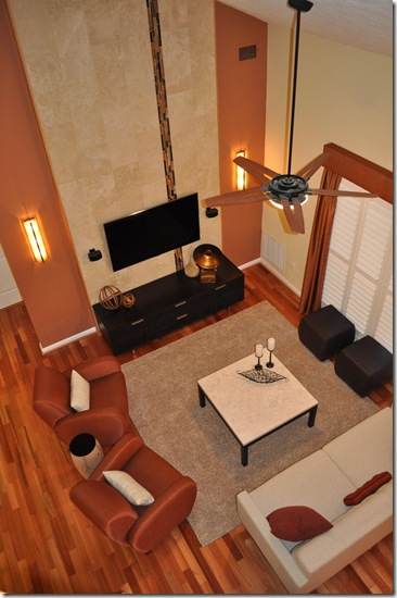
DSC_0247 The project began in mid July with a consultation and was recently finished and unveiled for a feature article in the Baltimore Sun: “Dream Home: Perry Hall Condo is a lofty perch” Sunday, January 1st Dream Home column.  My client, Wendy, is planning retirement in a few years and wanted to make her space an amazing place to come home to and feel finished - retirement ready.  concept sketchShe has a great appreciation for contemporary lines and simplicity.  She wanted to use her existing space better, increase her living room floor plan for a larger entertaining and social area, we also needed to incorporate a larger wall mounted TV into the design, and overall give everything a facelift!  As we talked I saw the potential for an amazing tiled focal wall, playing off the third floor condominium's vaulted ceiling. I drew a simple sketch with the wall idea and also showed a floor plan sketch which expanded the living room by pulling chairs off the existing (imaginary) room dividing line.  With the idea’s planted we started making plans for the exciting renovation!

Before photos:

phone picts 7 28 2011 076phone picts 7 28 2011 064     phone picts 7 28 2011 069phone picts 7 28 2011 074phone picts 7 28 2011 072   

imageimageThe plan was a go!   We selected 12” x 24” Travertine Tiles to be placed vertically with a glass accent tile also running vertically two thirds in.   With the contractor on board, (Leonardo Guevara of Bantam Contracting, LLC  (410) 258-3013   MHIC: 102680) we were ready to roll!  Everything went like clockwork!

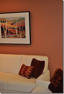
Furniture was ordered: Sofa, 2 rolling ottomans, accent chair, pillows and side table from Room and Board, Swivel Chairs from Nouveau, Travertine Cocktail table from Crate and Barrel. A sleek dark wood entertainment unit was ordered to perfectly fit the tile wall, and new light fixtures to accent and illuminate the wall! image imageA custom rug was added after furniture was placed.


My design focus was to incorporate a rich variety of textures both tactile and visual and adding warmth and comfort to the space. Pulling in contrasting elements of stone, wood, metal, glass, and textiles with rough, smooth and soft textural attributes.  Using contrasting lines by adding a few curves to the rectilinear and angular nature of the interior, while repeating colors to carry your eye throughout the space.  Colors were selected for the wall at the new tile/ TV focal: Benjamin Moore: Lenape Trail #1222  which worked perfectly with the exiting house’s soft yellow wall color to add contrast but keep it warm and interesting – accent walls in the right place and color enhance a space. 

 DSC_0439DSC_0254DSC_0388DSC_0266   DSC_0334DSC_0378 DSC_0381DSC_0331DSC_0332 

The wall color was such a hit we didn’t stop there! Adding a dining room accent wall color which continues through the shared dividing wall into the hall was a shade lighter than the living room color Benjamin Moore: Potters Clay #1221.  With these color transformations existing light fixtures were looking a little shabby, so we added a new hall light lantern style pendant, dimmer switches on everything we could, and added a beautiful zebra-wood drum pendent in the Dining room! Spectacular!

DSC_0409DSC_0318DSC_0368    

The Loft was repainted and the original living room furniture replace the older loft furniture.  The loft will get a little more attention next year!

DSC_0265

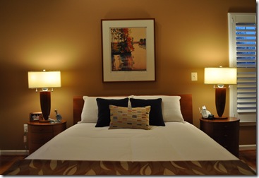
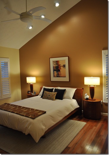
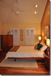
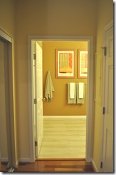
In the Master Bedroom we added Benjamin Moore: Richmond Gold HC-41 to the bed wall which warmed the wall, we brought the color into the Master bathroom as well with an accent wall.

DSC_0305DSC_0292 DSC_0311DSC_0296 

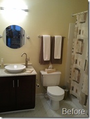
Even the Guest bathroom got a makeover – new porcelain tile to replace the vinyl, new toilet, new wall color, new towels, new shower curtain – wow!

DSC_0272 2011-09-23 15.51.55 

An amazing project!  Wendy loves coming home and can’t wait for retirement and even the timid housecat, Cinder, approves!

DSC_0423

all before and after photos taken by: Laura C Kimball, LCK Interiors

Thursday, December 29, 2011

Gothic Revival Styled Christmas Tree

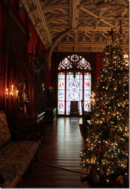
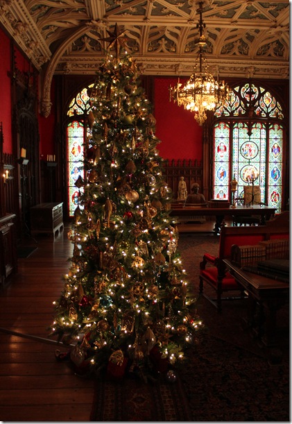
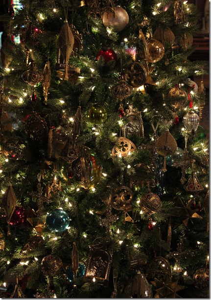
I enjoyed a trip to Newport, Rhode Island early December to tour the Beaux Art Mansions decked in holiday splendor!  I was enamored with the Marble House’s Gothic Room’s Christmas Tree – the room itself is an absolute masterpiece in gothic revival style and its tree display was the only interior area allowed to be photographed in the house – show and tell!  Yes, the tree was in every shot – I attempted every angle possible to get much of the room in too!

There is something fairytale and even magical about gothic design.  Rich, royal, intricate details with a rustic, simplistic quality. Religious undertones are in each arch pointing heavenward. Stained glass adds diffused colored light with the added hush of candle light in the heavily darkened room. An ethereal tracery ceiling lifts your spirit upward beyond the room. I especially enjoyed the Christmas interpretation. The tree was magnificent, I loved the careful attention to gothic details in the ornaments, a quiet, elegant medieval flare to the Christmas Decorations. Gilt Moravian stars, Madonna and Child framed art, the Holy Family and Saint depictions in gold and brass, Gothic arches, trefoils, quatrefoils, baubles wrapped in velvets and adorned with gold trimmings, ornate golden crosses, heavy crackle glass balls and drops, and even little gothic steeples.  IMG_4942IMG_4948IMG_4949IMG_4951IMG_4938IMG_4937IMG_4936IMG_4935IMG_4943

Merry  Christmas

Sunday, November 6, 2011

Organic Architecture

2011-10-22 16.30.11Traveling from Pittsburg, PA Saturday, October 22 from an IDEC Regional conference, I prearranged to visit Frank Lloyd Wright’s Falling Water as it was somewhat on the way home and a must see for all Designers and Architects (it is probably FLW’s best known design) and I hadn’t been there yet!  A beautiful, picturesque day, autumnal brilliance.  Driving over hill and mountain with amazing vistas it was an ideal drive and a wonderful destination! 

Built right into the hillside’s rocks – even incorporating the rock formations right into the interior spaces - the cantilever design jets out above the bear run waterfall.  Vertical and horizontal elements appear to grow out of the earth, nestled into place, with a strong sense of belonging.

Interesting to note this modern style was built in 1935, with amazing modern amenities and features, it clearly influenced the post modern styles of the 50’s, 60’, and 70’s.  I saw the links to Japanese design and shibui ideas in the spiritual relationship of man to nature.  I also found an incredibly strong sense of the southwest influence, almost pueblo like in style, with materials, colors, and compartmental levels with stairs leading in and out.  Considering FLW was working on projects in Arizona – I can understand his inspiration being brought to the east with modern flair.

Interiors were physiologically and psychologically fascinating, lower ceilings, full wall windows, outdoor space on every level, cozy and intimate yet the public areas were vast, wide, open planned.  playing with light to draw one in and out of a space.  Signature small desk which was enlarged for real use at the request of the client required a cut out for window to open – similar solution found in the hollyhock house in LA.   As a Designer/ Architect he designed and informed the client – by design how the space is to be used.  I also appreciated in amusement that he gifted a few Japanese block prints – reminding me that if you want to have the proper art hung in the proper places it ought to come with the house. 
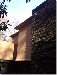
Read the story of the Architect/ Designer and the Client’s experiences with the process of designing and building Falling Water: http://fallingwater.org/explore?to=0

Enjoy the detail shots below:

2011-10-22 16.16.01 2011-10-22 16.17.13 2011-10-22 16.17.34 2011-10-22 16.18.28 2011-10-22 16.19.03   2011-10-22 16.21.22  2011-10-22 16.21.45 2011-10-22 16.22.00 2011-10-22 16.22.20 2011-10-22 16.22.26 2011-10-22 16.22.39 2011-10-22 16.29.012011-10-22 16.20.182011-10-22 16.23.15   2011-10-22 16.29.31    


A stop in Ohiopyle, PA for dinner and then on the road again – beautiful day for a scenic drive!

 2011-10-22 17.38.02 2011-10-22 17.49.39 2011-10-22 18.02.36