(No. 5) 
I love color, all color. I am fascinated by color, it’s ability to communicate emotion without words, offer connotations and encourages a psychological response. I am amazed at the process we see color, the mechanics of the human eye is quite amazing.
I am most fascinated with color connotations, our personal response to color. Generally we can all agree on some of these connotations: pink is sweet, red is flashy, white is pure, and so on. We each have a personal experience as well, perhaps you grew up with an avocado fridge and that color had never sat right with you ever since, or grandma’s house was a big pink flower explosion, that either you detested or perhaps now long for a hint of those memories. I have researched color and studied many books by Faber Biren as a student, a professional and especially now as an as interior design instructor. His work is still very viable, although our world has certainly changed since then. Color is everywhere especially a great consideration in Design and Marketing. One of my favorite color experiments to share is from an early study of color marketing for laundry detergent, specifically washing machine dry laundry powder (done in the 50’s). A study to see how products perform.
Product A was in an orange box – results: it brightened well – almost too well and was thought a little harsh, extremely clean
- Product B in a blue box – Results: fabric softener, great on color – color fast, but didn’t clean as well as the first, but also not as harsh on the color.
- Product C in a blue and orange box – Results: Just right, color fast and cleans, not to harsh.

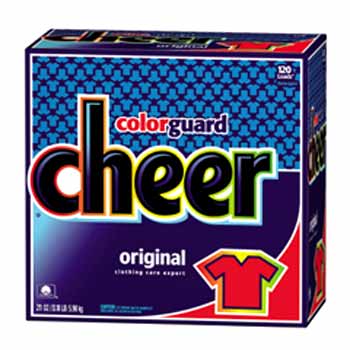
This study showed the power of color perception - the boxes all had the same detergent, amazingly different results for the same laundry detergent product. Although there are variations in detergent from brand to brand, color still has a great deal of influence, look at our laundry detergent logos and packaging today, many follow these results. Think color and think about what each product wants to be known for (see the label on the all blue cheer box “color guard”).
Our changing times and increase in technology has given rise to new symbolism for colors. While green is the color term used to represent the movement of all things sustainable and earth friendly. Blue has become our technological hot  shot! The color of innovation and forward developments. “The right shade of blue can be worth $80 million – at least that’s what they say about Bing’s blue link color. Microsoft’s research team found that blue engaged people the most and they tested various shades of blue in user groups. First, they determined that their previous shade of blue (a paler hue) lacked confidence. Finally, they wound up with a shade of blue quite similar to the one used by Google. Based on user feedback, the team estimated the best blue color could generate $80 million to $90 million in ad sales.”
  http://colormatters.blogspot.com/2010/03/color-thats-worth-80000000.html Think about product names that encourage this blue movement: Bluetooth, Blu-ray beat out the HDDVD, Jet Blue, The “Blue Man Group” showcase an innovative multimedia presentation, and even hybrid car technology is getting in on the action… although “green” in nature – the technology is what they are really selling – check out the new hybrid logos – they are blue!
Learn more about the basics in Color from this great website: http://www.colormatters.com/colortheory.html
No comments:
Post a Comment